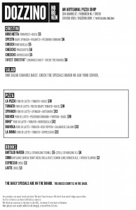
My husband often laments the dearth of quality restaurants in our neighborhood (lots of cooks, but not many chefs), so we were excited to see a new place open up on our block steps away from our front door last November.
Every time we go in, we’re impressed by their branding and marketing. (Disclosure: While we’re both in marketing, neither of us has had anything to do with their work. Except eating their product with some frequency.) After our last visit, I was inspired to use them as an example for several things every company should do in their marketing/branding.
Spare design is good design.
From the moment you walk in, this is apparent. The space is simply decorated, with rough hewn wood tables and a granite bar countertop. Nothing fancy, nothing unnecessary. The same goes for their website and menu — no unnecessary clip art; no long, overdone food descriptions (granted, at a pizza place, this is a little easier to do). Even their small kitchen maximizes space; clutter is impossible.

Branding = consistency.
They chose a large, bold font (from searching through My Fonts, I think it’s Twelve Oaks) and use it in about 95% of their marketing: On the menu. On the website. On their t‑shirts. Last weekend, we saw that they even used it in an in-house video that ran on the TVs. The font (and the spare copy) was how we knew it was a video about DOZZINO, rather than local TV.
Always pick quality over quantity.
The menu is short: 7 types of pizza, and salads and desserts are posted on their specials board. They don’t have a lot of drink choices (soda, water, espresso — and, like a lot of places in the Boken, it’s BYOB). But they’ve invested wisely. A wood-burning oven means they’re the crispiest pizzas in town. And the top-of-the-line espresso maker means (some of) the best espresso in Hoboken. And those are the things that will keep bringing customers like us back.
Social media doesn’t have to take up a lot of your time.
They keep an active blog (55 posts in April, 52 posts in May), but many of the posts are simply photos of the restaurant. The Twitter feed is mostly populated by pics of their specials board, so followers are getting the daily specials, along with information about hours and restaurant events. Everything informs the customer about the location and product, without taking up too much time they’d rather spend baking pies.
A sense of humor is always a good thing.
Their copy may be spare, but it’s to the point. Who doesn’t want a pizza made with “fresh dough, a wood fire and love?” The video uses repetition to remind viewers about what they offer: “We gots fresh dough daily… We gots crisp produce… We gots a hot oven.” Is it grammatically correct? No. Do I really care? No. They’ve gotten their point across in a quick and humorous way, and given that everything (including lovely words like mozzarella, sopressata and prosciutto) is spelled correctly, it’s pretty clear that it has been done on purpose.
So that’s a few things that DOZZINO has done well. Combine that with a great product and a nice patio overlooking a bocce court, and I’d say they’re going to do very well indeed.